
Diabeteswise Device finder uI design Samples
For people living with diabetes (PWDs), the process of navigating options for diabetes technology can be overwhelming and heavily influenced by healthcare provider biases. The Device Finder was added to the website as an interactive feature aimed at addressing this problem for PWDs. After several rounds of user feedback and design iterations a final working design is currently live on the website. Below are two samples of my collaborative UI design work on the Device Finder experience: (sample 1) the Device Readiness Report and (sample 2) the UI design iterations and prototype for the ‘compare’ stage of the user flow.
Sample 1
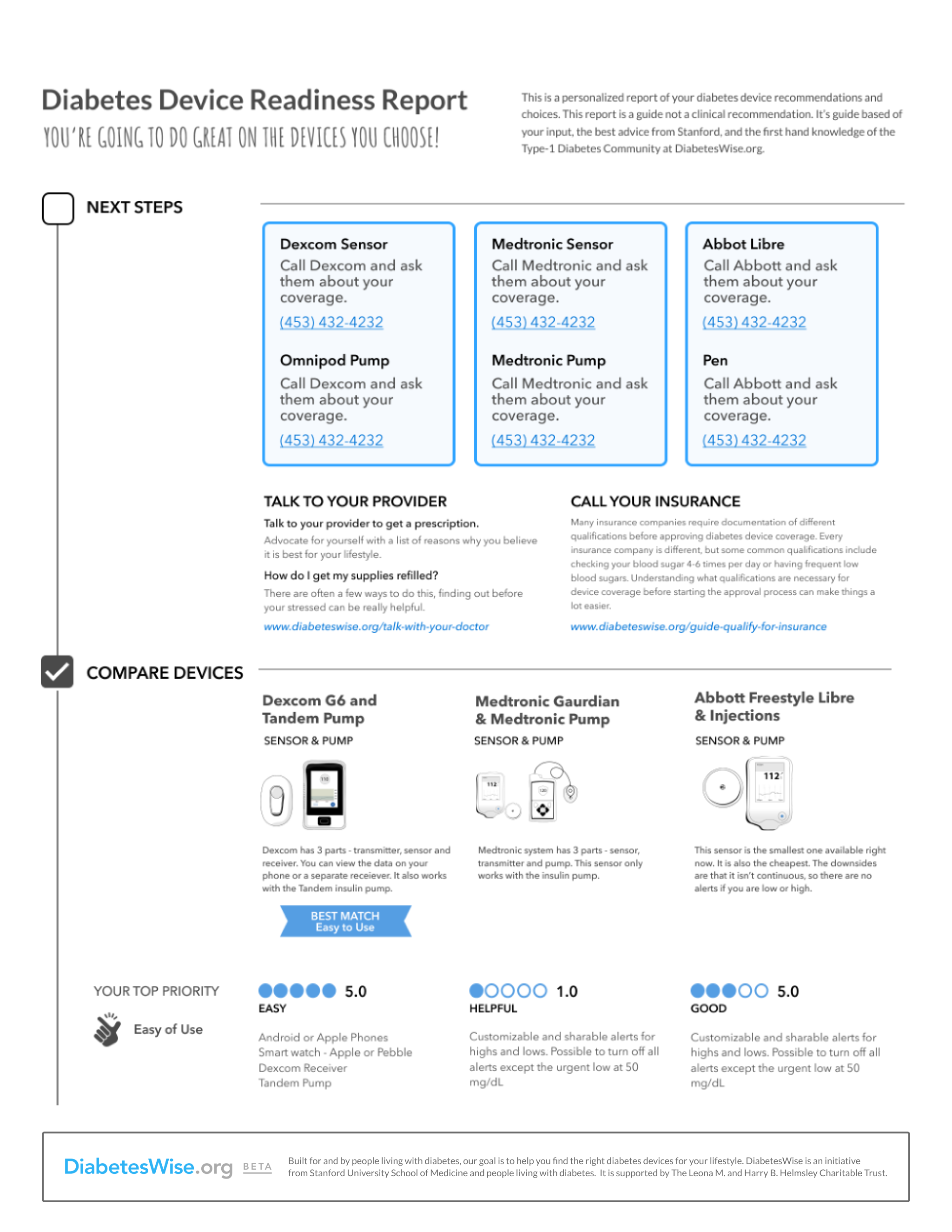
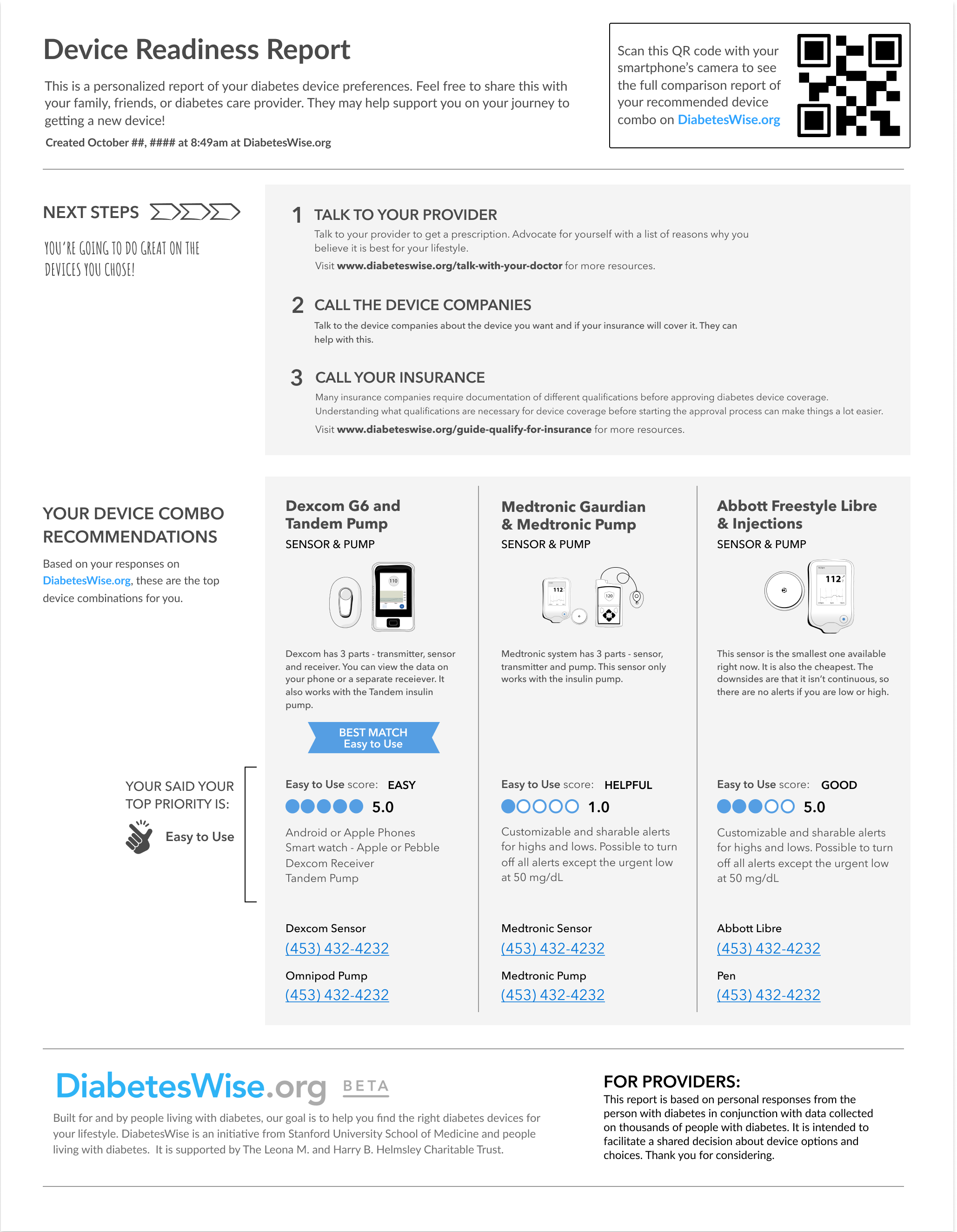
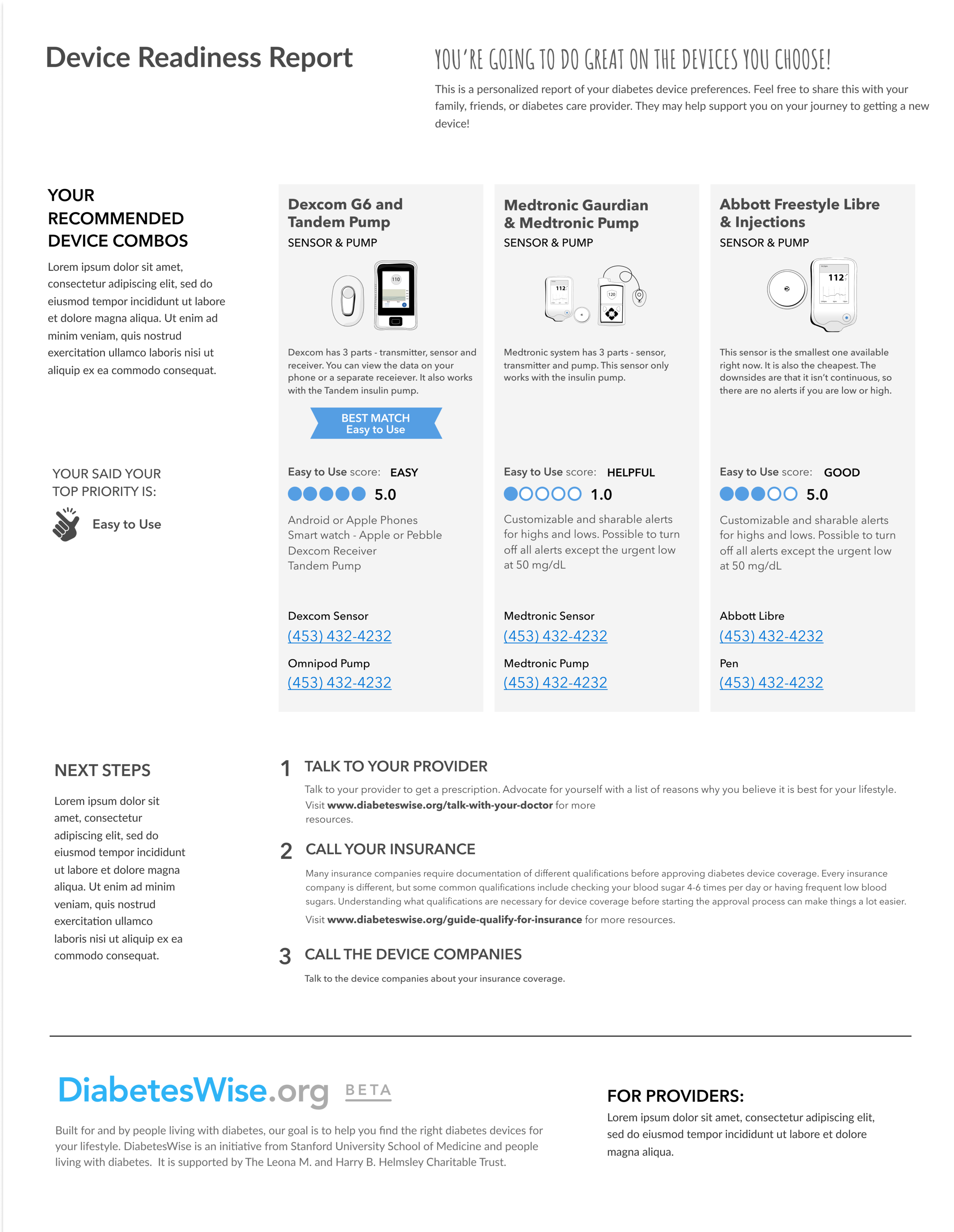
The Device Readiness Report is a tangible artifact of the Device Finder user journey. Users compare diabetes devices that are likely to be a good match for their priorities and concerns, and then print out the report to take to their provider, to have alongside them during phone calls with insurance or as a guide with the device manufacturers.
Several iterations are shown to the right.
It was designed to (1) meet the user’s needs with actionable support, (2) be present with the user journey off-screen, and (3) represent the user needs in the presence of a healthcare provider and facilitate a conversation between them.
Sample 2
The Device Finder went through stages of design iterations. After handoff from HealthMade Design, Stanford leadership requested changes to the Device Readiness Report. We also identified design opportunities to improve the usability of the Device Finder UI during the compare stage. Changes to the design were sketched and developed on a tight timeline in order to meet deadlines for initiating the clinical trial that was intended to test the Device Finder. The Device Finder remained confidential, only available to study participants of the clinical trial, until the trial was completed. It’s since been added to the public-facing DiabetesWise website for public use.
To the right is a prototype that captures the stage of the process just before final design iterations were implemented for the clinical trial.
A few of the design changes:
Moved the compare selection checkbox from the bottom of the device combo card to the top so the user can view them near the title of the device combo card
Removed quantified ratings for device combos
Reduced height of the Compare selection confirmation banner
Cleaned up hover and deselection behavior of selected device combos in the Compare selection confirmation banner
Reprioritize order of information presented on final Compare screen and match to the printable report